Logo
Our Firefly logo, combining an iconic symbol and a wordmark, serves as the cornerstone of our visual identity. This fusion embodies our values and vision, and it’s the emblem you’ll encounter across our brand. In this section, we’ll take a closer look at the guidelines for the logo.
Overview
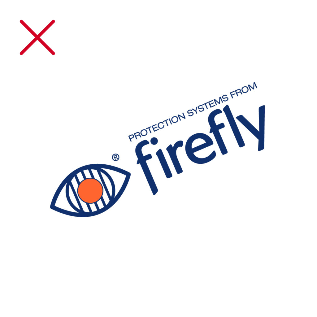
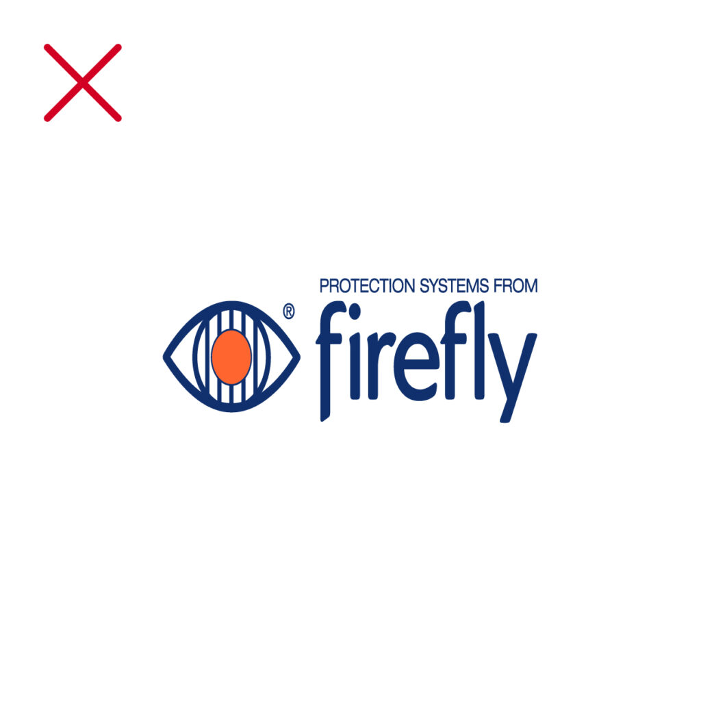
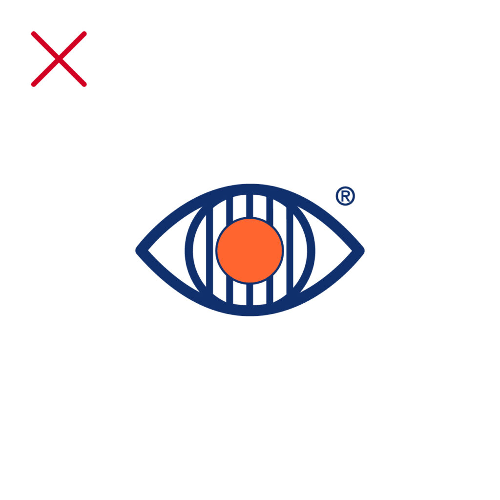
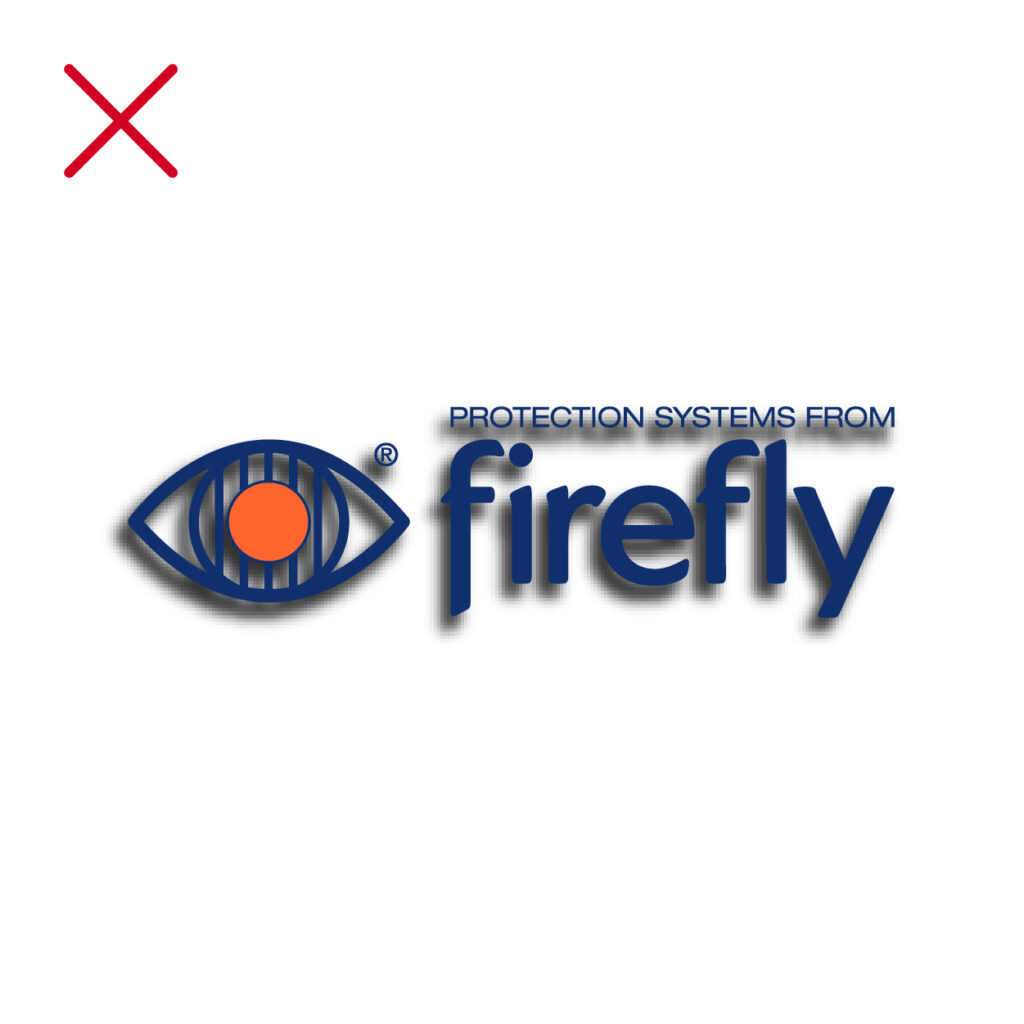
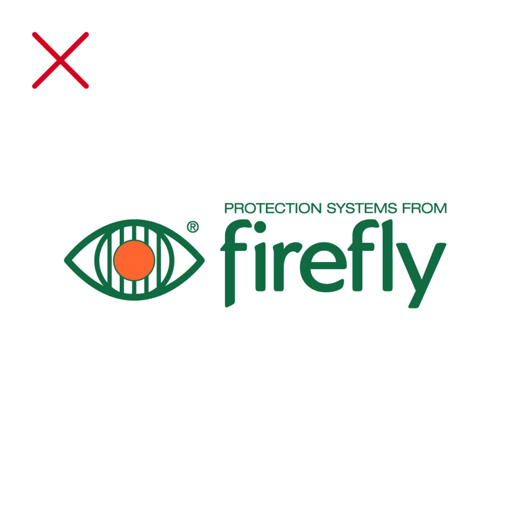
The correct usage of our logo is as follows. The logo must never be altered or combined with other graphical elements or words. It should never be used in running text, or to form part of a new logo.
Clear space
To maintain clarity and integrity of the Firefly logo it is essential to keep the minimum clear space around the logotype. opt for the highest resolution available to ensure a sharp and professional appearance.
Our logo should always have space to breathe. We call the space around our logo the red zone. Please don’t put stuff in it.
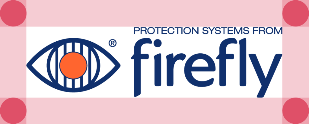
The minimum clear space is always a minimum of 1x the size of the iris of the eye. No other elements may sit within this established exclusion zone.
Exclusion zone exemptions
There are instances where the designer may be exempt from having to respect the exclusion zone of the Firefly logo. This typically occurs in cases where the surrounding area of a brand asset is limited in width and/or height.
Size
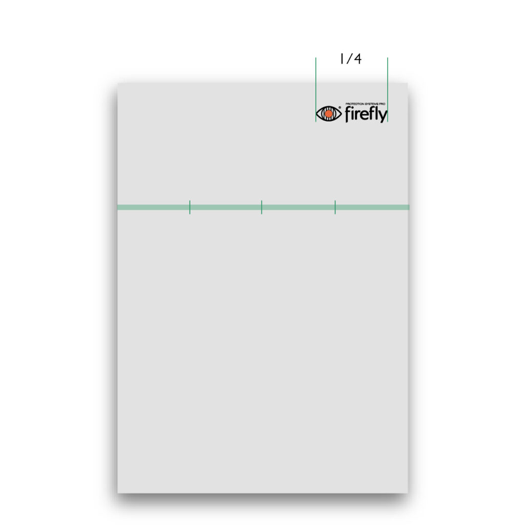
To ensure the logo remains legible in different contexts, it must be sized relative to the format. The size is different for each format, in order to present the brand in a clear, relevant and consistent way.
The width of the Firefly logo varies according to the total width of the format on which it is to appear.
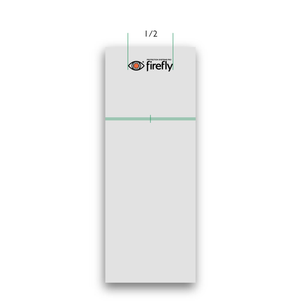
Size for digital banners
Portrait: Logo width is one quarter (1/4) of the format.
Portrait tall/narrow: Logo width is one half (1/2) of the format.
Landscape: Logo size is one sixth (1/6) of the format.
Landscape wide/narrow: Logo width is one quarter (1/4) of the format.
Square: Logo size is one third (1/3) of the format.
Size for print and outdoor advertising
Roll-up: Logo width is one third (1/3) of the format.
Portrait: Logo width is one quarter (1/4) of the format.
Landscape: Logo width is one sixth (1/6) of the format.
Large format: Logo width is one third (1/3) to one sixth (1/6) of the format
Size for end of video
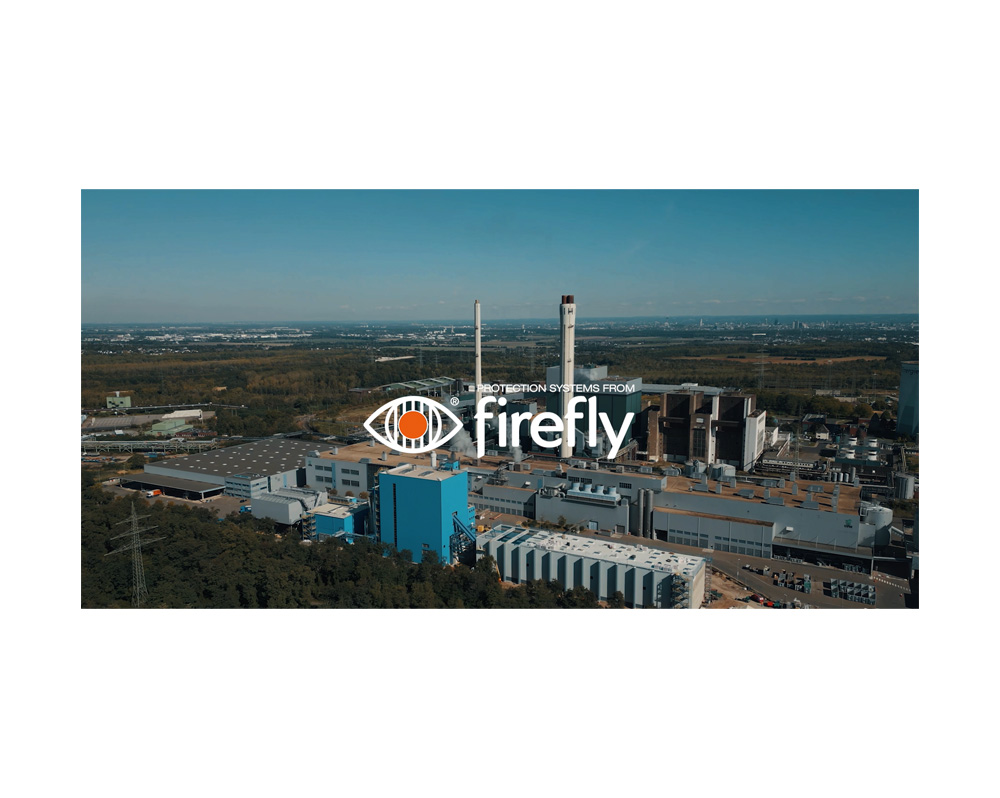
Wide: Logo width is one quarter (1/4) of the frame width.
Square: Logo width is two fifth (2/5) of the frame width.
Tall: Logo width is two fifth (2/5) of the frame width.
Minimum sizes
- Digital: A minimum height of 20 px is established for the Firefly logo.
- Print: A minimum width of 20 mm is established for the Firefly logo.
Before resizing logos in your designs, always ensure ‘constrain proportions’ is checked. By doing so you avoid accidentally warping our brand elements.
Positioning
The default position of the Firefly logo is in the top corner, either on the left or the right side of the prescribed area. Consider the narrative and context when choosing either left or right positioning. Positioning is flexible, to help designers meet requirements and maintain relevance.
Colouring
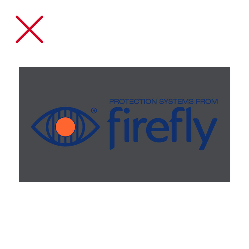
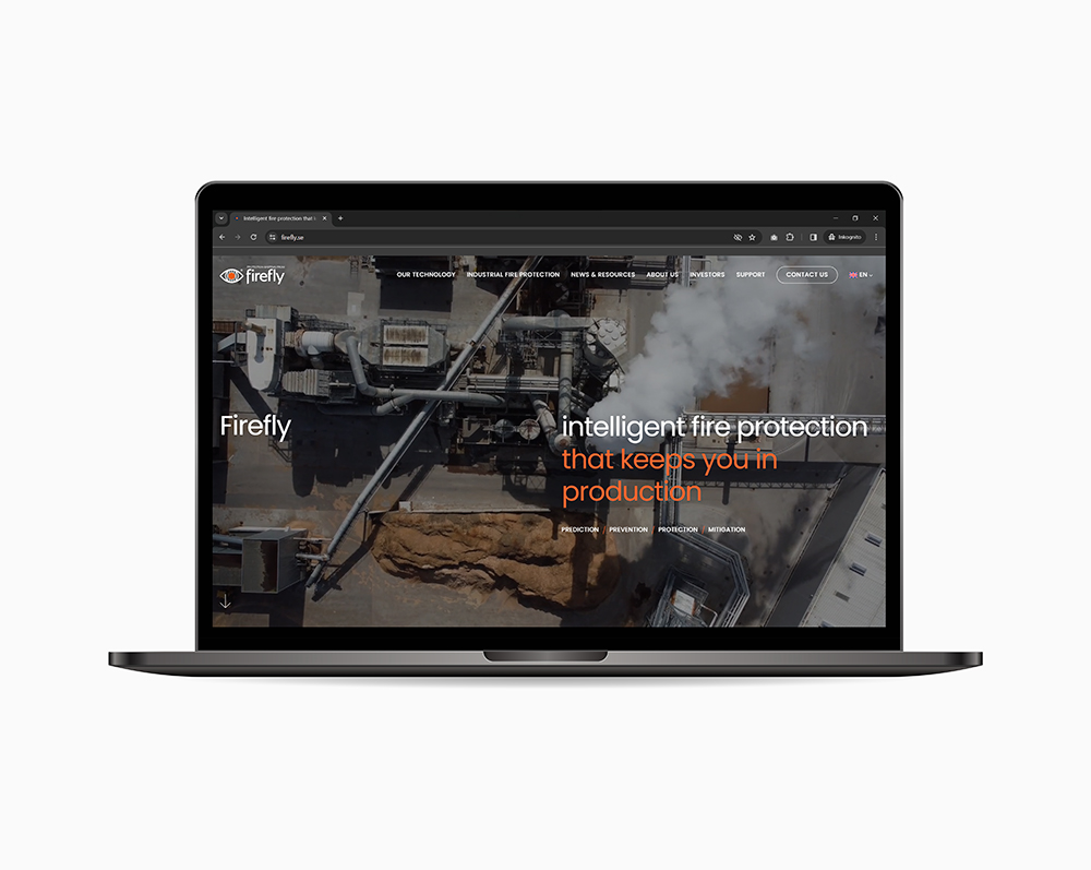
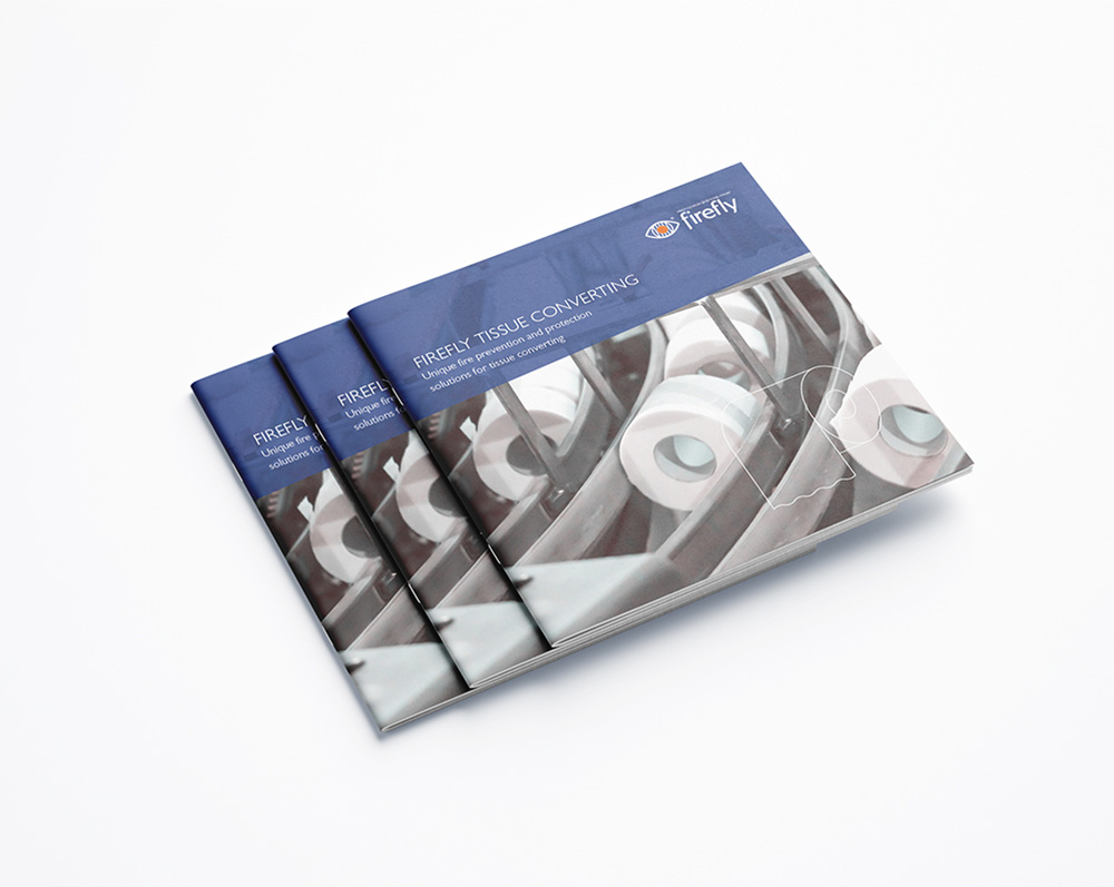
Black and orange is the default colour for the Firefly logo. The white and orange variant is to be used on dark backgrounds and/or images. Legibility is a priority, to meet legal requirements for contrast and clarity. For exhibitions and marketing material dark blue and orange is the default colour.
Printing one colour? Either use the black or white logo, never use dark blue as a single colour for the Firefly logo.
Incorrect usage
To uphold a consistent brand identity, we always treat the logo correctly in terms of style, size, positioning, and orientation. This is also required for legal reasons.
