Icons
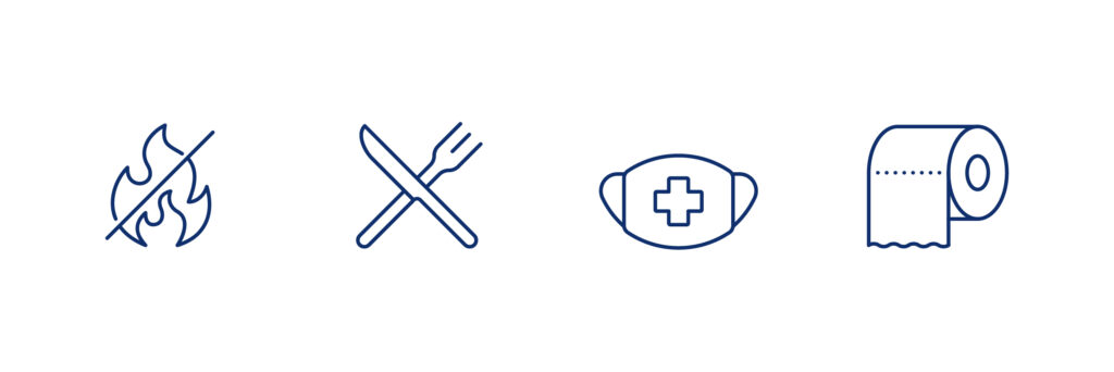
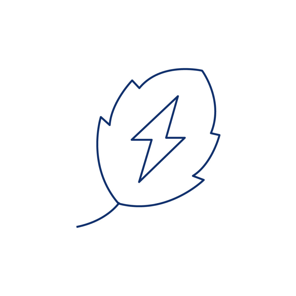
At Firefly, icons hold a special place as key brand attributes. These icons, in harmony with our typography, copy, color, imagery, motion, and, naturally, our logo, are instrumental in conveying the essence of the Firefly brand. Here, we introduce the guiding principles for creating thoughtfully designed icons that uplift and represent our unique brand personality.
We assess all icons and icon sets against the following principles, tailored to Firefly’s iconography:
- Effectiveness
- Simplicity
- Perspective
- Consistency
These criteria guide our evaluation process to ensure that Firefly’s icons meet the highest standards of design and functionality. When designing icons for Firefly, adopt a uniform approach. Avoid 3D perspectives and aim for a flat, 2D style that harmonizes with our existing icon set.

Shaping icons
Combine Vital Ideas with Creative Playfulness. Our Firefly icons find inspiration in everyday objects, using simple geometric shapes to convey their essence. Each icon boasts distinctive details, resulting in a unified set of branded icons that exude personality and charm.
Consistency builds trust. Before creating new icons, look at what we already have. Keeping our icons similar to each other makes everything look and feel the same. This helps people trust us, no matter where they see our brand.


Ways to infuse brand personality into iconography:
- Blend straight and rounded corners gracefully
- Develop a style for metaphorical icons
- Harmonize icon size, shape, and impact within the design
- Experiment with adding playfulness and memorability to icons