Colour is a crucial element in Firefly’s design system. When used effectively, it not only maintains a consistent brand identity but also helps define our refined and understated visual style.
Our colour palette primarily revolves around timeless and versatile blues and grays, with the addition of an accent colour, the Firefly orange. Blues and grays are your go-to for most situations, while the accent colour should be used sparingly. Specific exceptions may apply, and guidance will be provided for particular initiatives or campaigns.
Accent colour
FireFly orange
CMYK 0 / 75 / 99 / 0
RGB 255 / 101 / 47
HEX # ff652f
PMS 021 C
Primary colours
Firefly blue
CMYK 100 / 79 / 0 / 37
RGB 2 / 26 / 68
HEX # 021a44
PMS 295C
Secondary colours
antracit grey
CMYK 0 / 0 / 0 / 91
RGB 58 / 57 / 56
HEX # 3a3938
PMS 426C
Steel grey
CMYK 66 / 51 / 27 / 11
RGB 100 / 111 / 141
HEX # 646f8d
PMS 2374 C
Medium grey
CMYK 38 / 29 / 22 / 4
RGB 167 / 169 / 180
HEX # a7a9b4
PMS 422 C
Light grey
CMYK 11 / 7 / 2 / 0
RGB 230 / 232 / 242
HEX # e6e8f2
PMS 650 C
Cloud grey
CMYK 6 / 4 / 2 / 0
RGB 242 / 244 / 248
HEX # F2F4F8
PMS 656 C
Black
CMYK 60 / 40 / 40 / 100
RGB 0 / 0 / 0
HEX # 000000
PMS Black
White
CMYK 0 / 0 / 0 / 0
RGB 255 / 255 / 255
HEX #FFFFFF
PMS White
Correct usage
Text can be coloured. Use white, blue, grey, or black as primary colors. For emphasis, one accent colour may be used.
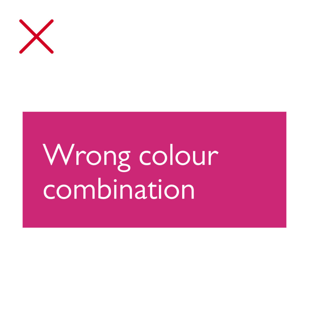
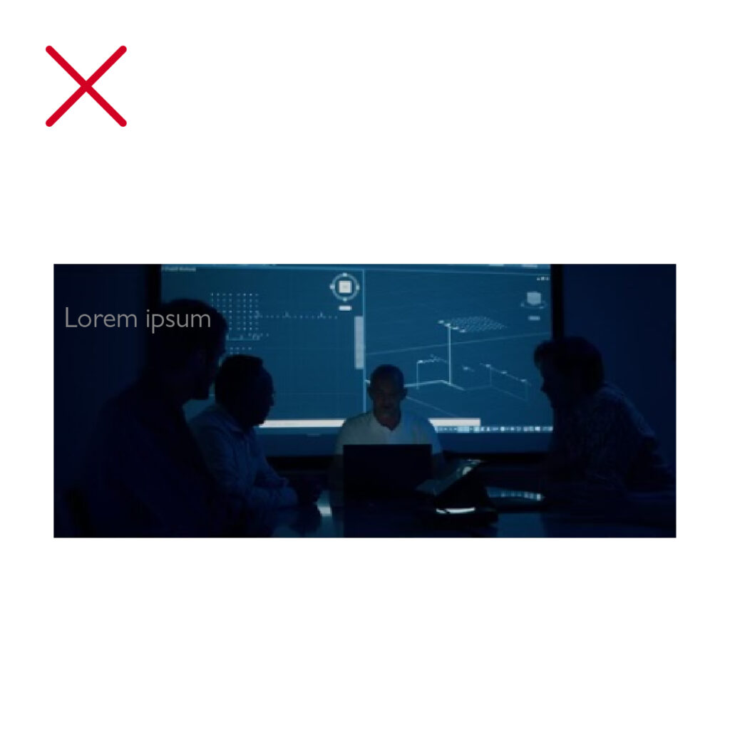
Incorrect usage
Here are examples of what to avoid.
Do not use colours outside of the Firefly brand and colour palette.