Typography
Typography plays a crucial role in our brand communication. Maintaining a consistent typographic style guarantees readability and fosters brand recognition across various platforms, ensuring a unified brand experience. We use British English as the default language in design files.
Gill Sans MT Pro — For printed use
Gill Sans MT Pro Book is our preferred typeface for a variety of text elements when it comes to printed materials, serving as the default choice for headings, subheadings, introductions, body copy, and captions. This font combines legibility with functionality, offering a range of weights to accommodate diverse design needs. The font collection includes a total of 16 styles, which includes five italic options.
While we offer a diverse range of font styles, it’s important to note that our default and recommended style for use is Gill Sans MT Pro Book.

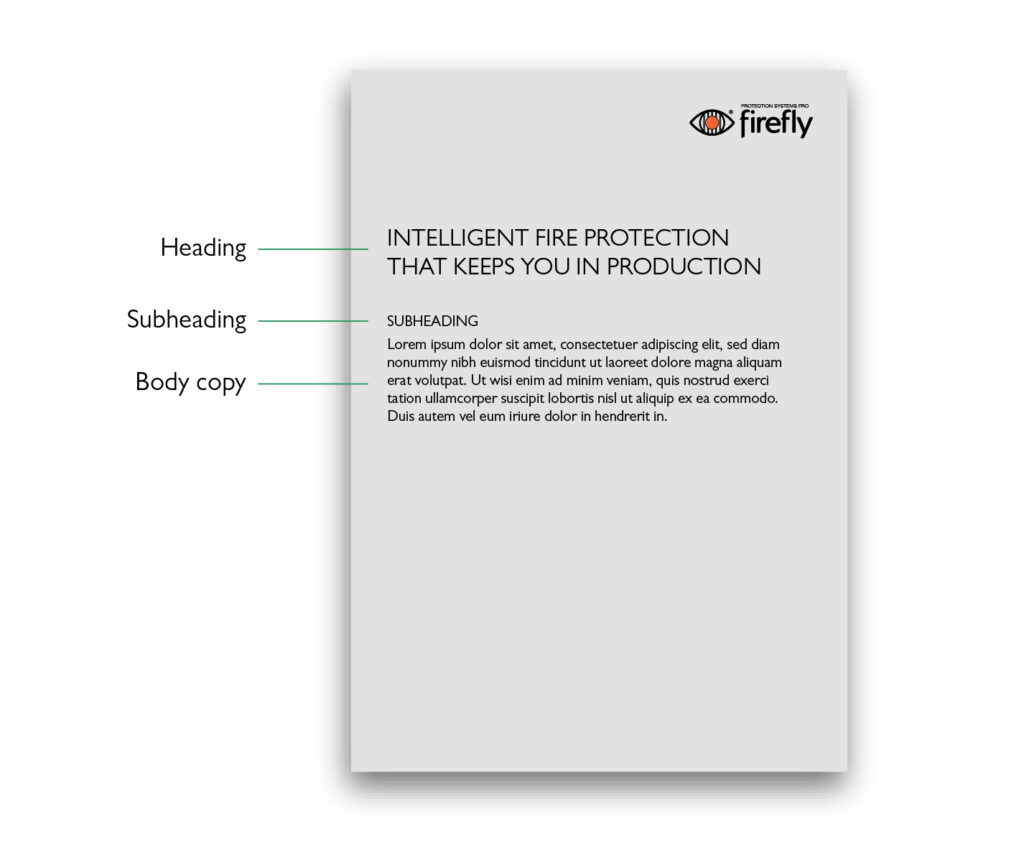
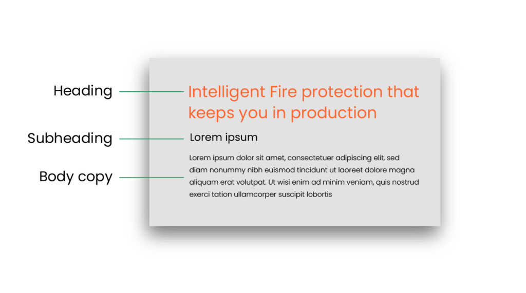
Hierarchy
A clear hierarchy of type sizes helps people understand the order of importance of the information we’re sharing. Use different sizes and uppercase/lowercase to establish this order. We use uppercase in titles, headings, subheadings and labels, that means we capitalise the whole sentence.
A heading should never be longer than three rows, if an exception occur, use sentence case. That means we capitalise only the first letter of the first word.
Poppins — For digital use
Poppins is our preferred typeface for a variety of text elements, serving as the default choice for digital use. This font combines legibility with functionality, offering a range of weights to accommodate diverse design needs. The font collection includes a total of 5 styles.

Hierarchy
A clear hierarchy of type sizes helps people understand the order of importance of the information we’re sharing. Use different sizes this order. We use the orange colour for headings, to make it stand out.
Arial — For special cases
When our primary typeface, Gill Sans MT Pro, isn’t accessible, we turn to our secondary typeface, Arial. This typeface maintains our brand’s identity and ensures readability, allowing us to consistently deliver our message even when circumstances change.
This typeface is great for use in Power Point presentations and corporate templates.

Line lenght
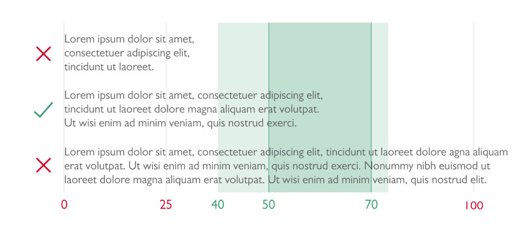
Line length determines the number of characters per line and plays a key role in readability. The ideal line length for body text is around 50 to 70 characters per line, though a range of 40 to 75 characters is acceptable.
An easier way to measure this is by word count. For unjustified text, aim for 8 to 12 words per line. Lines that are too short can break sentence flow and lead to excessive hyphenation, making the text harder to read. Lines that are too long, more than 12 words, can be tiring and increase the risk of losing one’s place when moving to the next line.
For justified text, the ideal line length is 12 to 15 words. This helps maintain even word spacing and minimizes issues like excessive hyphenation, large gaps between words, and distracting “rivers” of white space.
By following these guidelines, text remains both visually balanced and easy to read.
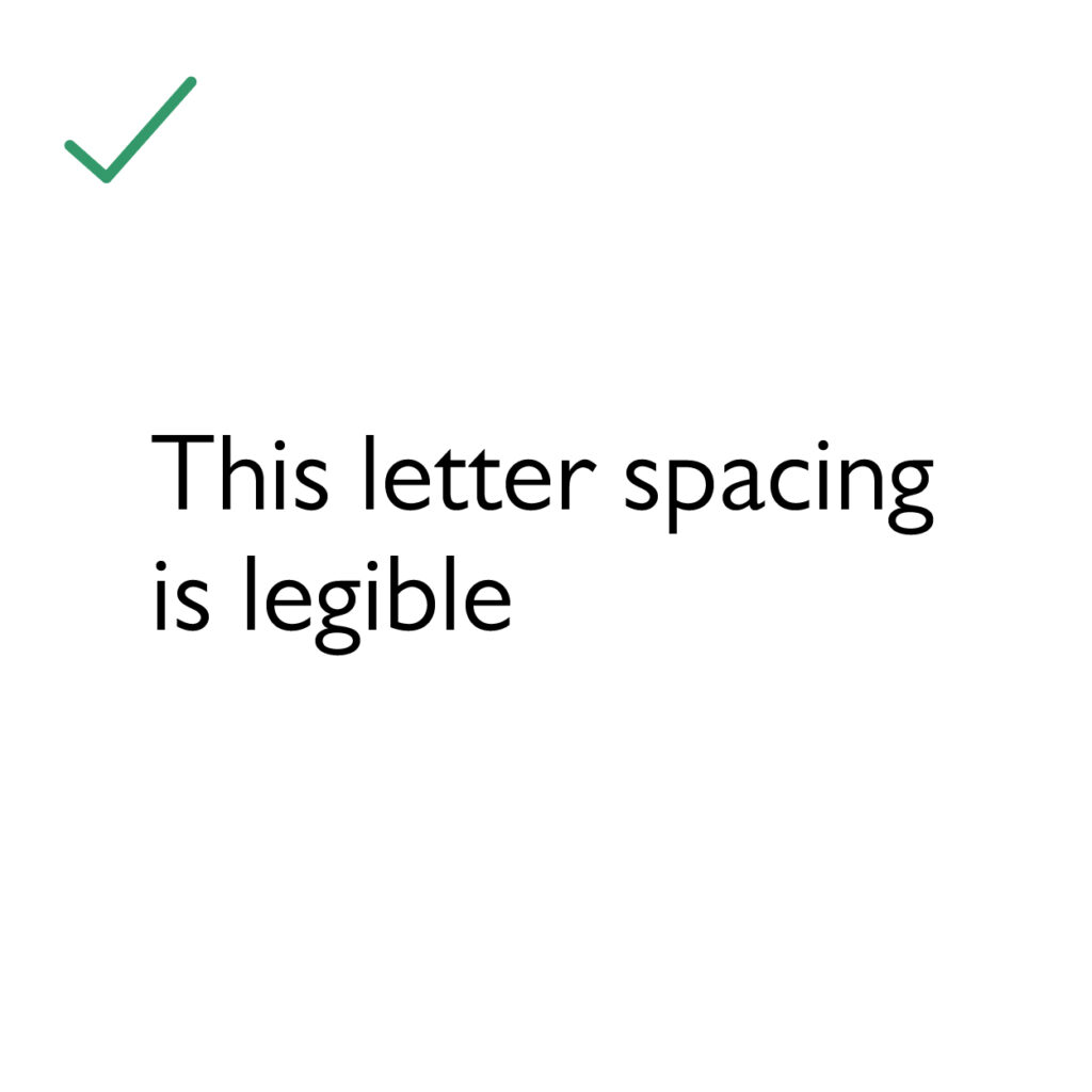
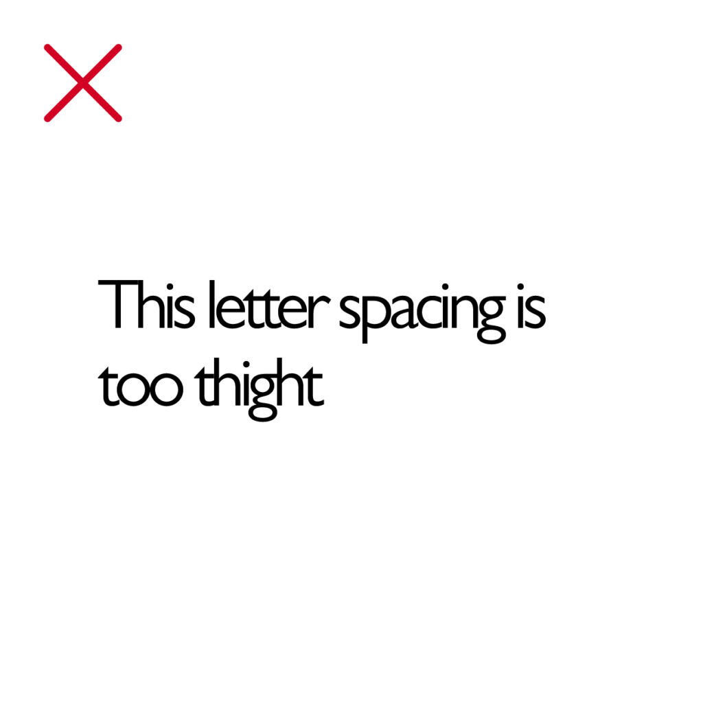
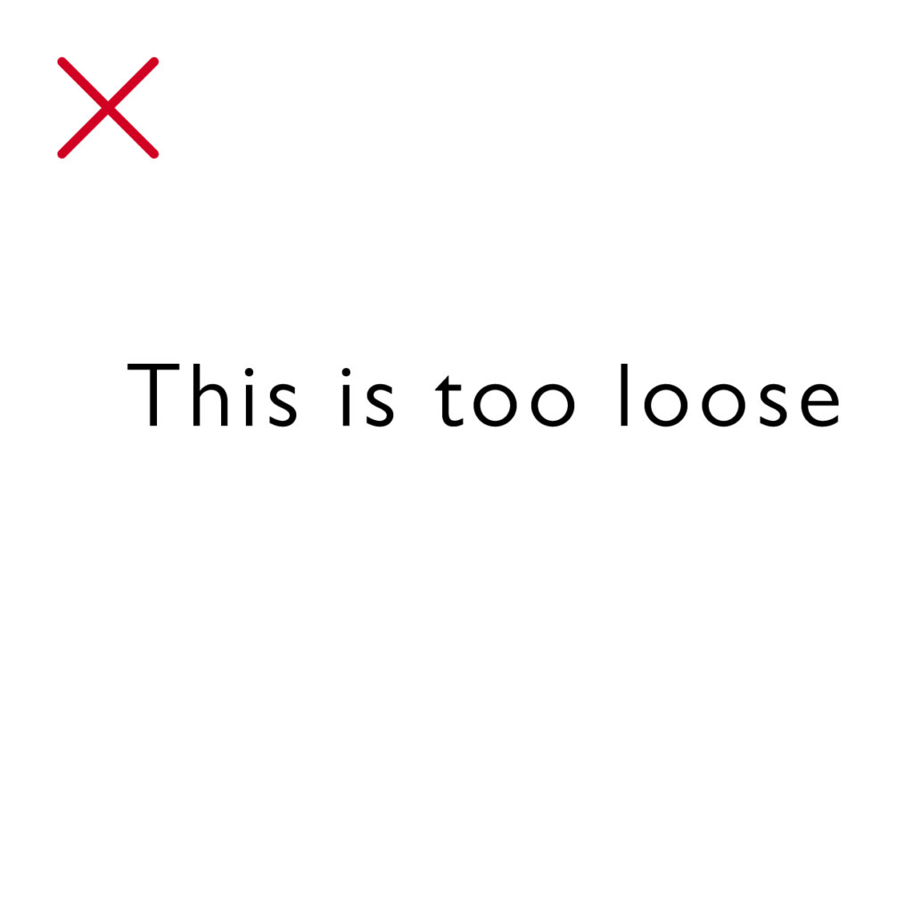
Letter spacing
Letter spacing, often referred to as the space between letterforms within words, serves a fundamental purpose—enhancing readability. In most instances, default letter spacing suffices, and adjustments can be made when necessary to optimize legibility.
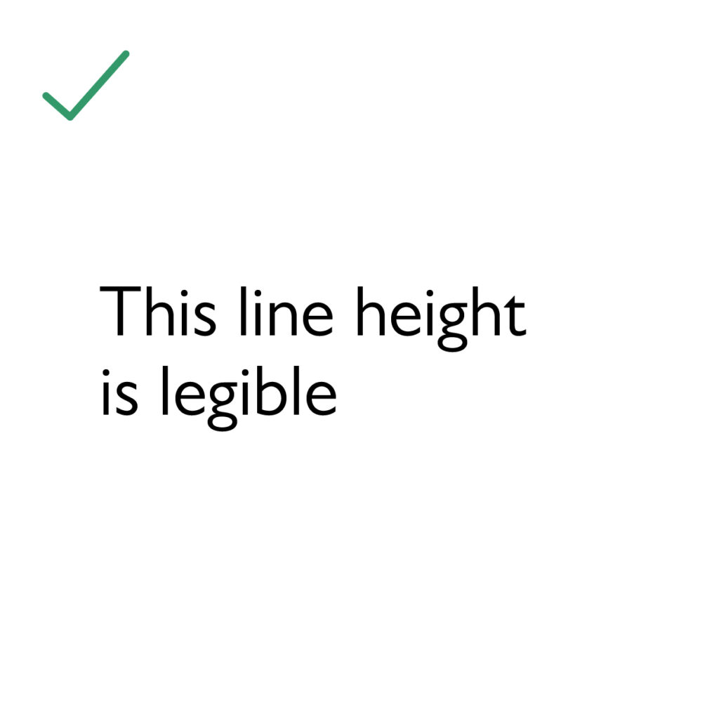
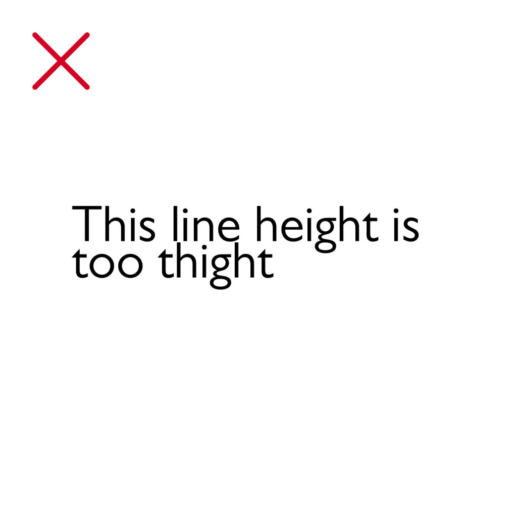
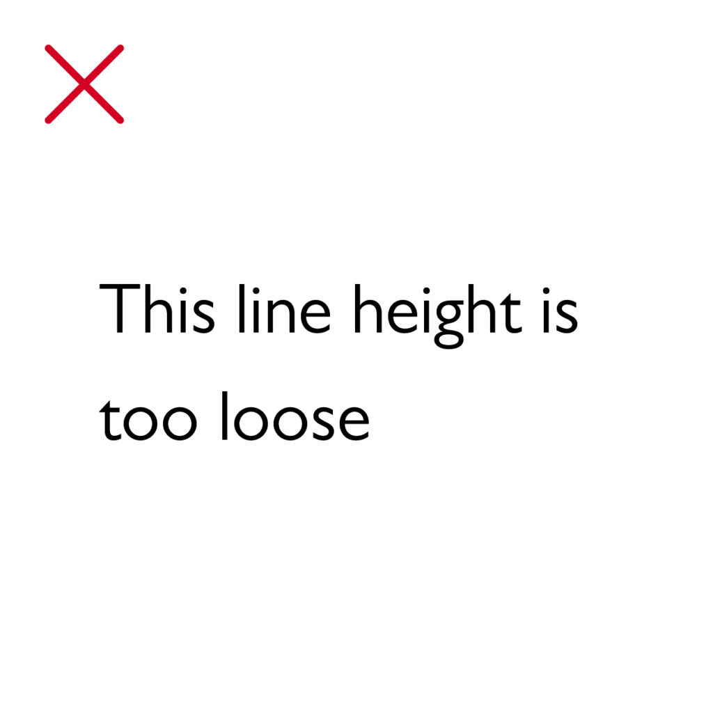
Line height
Line height, the vertical space between lines of text, serves a crucial role in enhancing text readability. Determining the optimal line height depends on the specific context. We carefully tailor line spacing to strike a balance between word count, white space, type size, and overall visual aesthetics, ensuring the best reading experience.
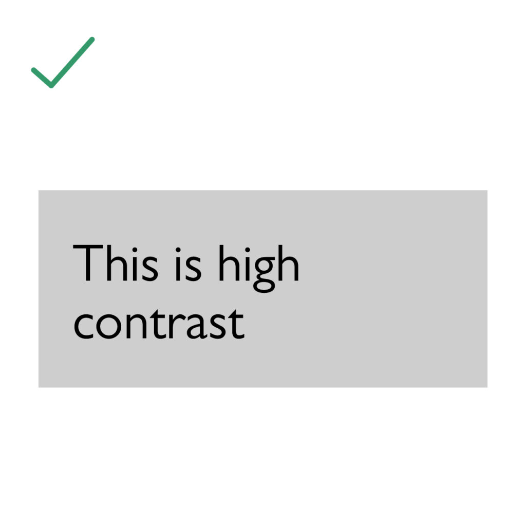
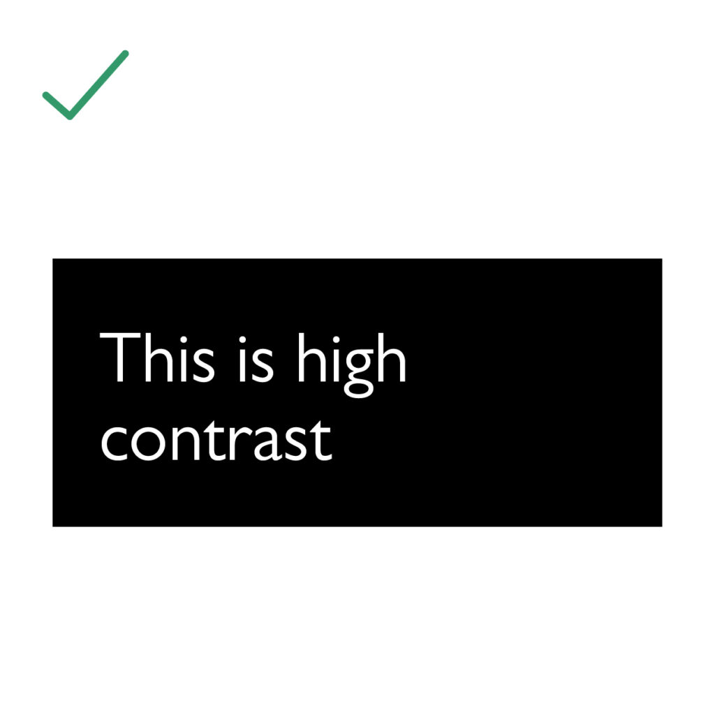
Contrast
To ensure the legibility of text in your designs, it’s crucial to provide sufficient contrast with the background. When using light backgrounds, opt for a dark text color, and vice versa when using dark backgrounds.
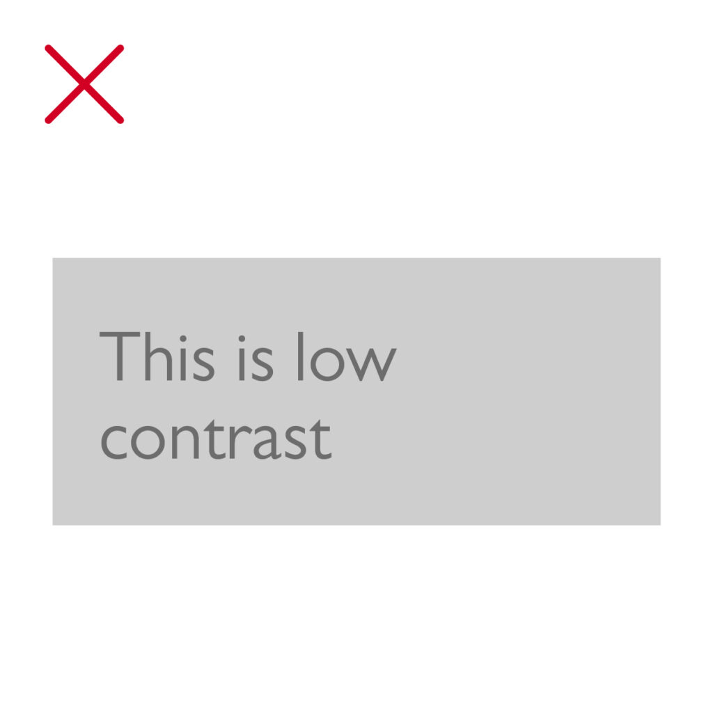
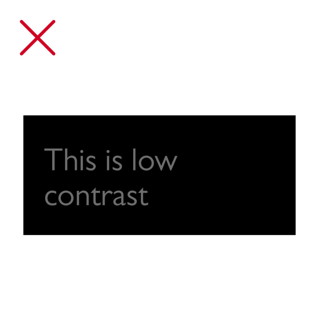
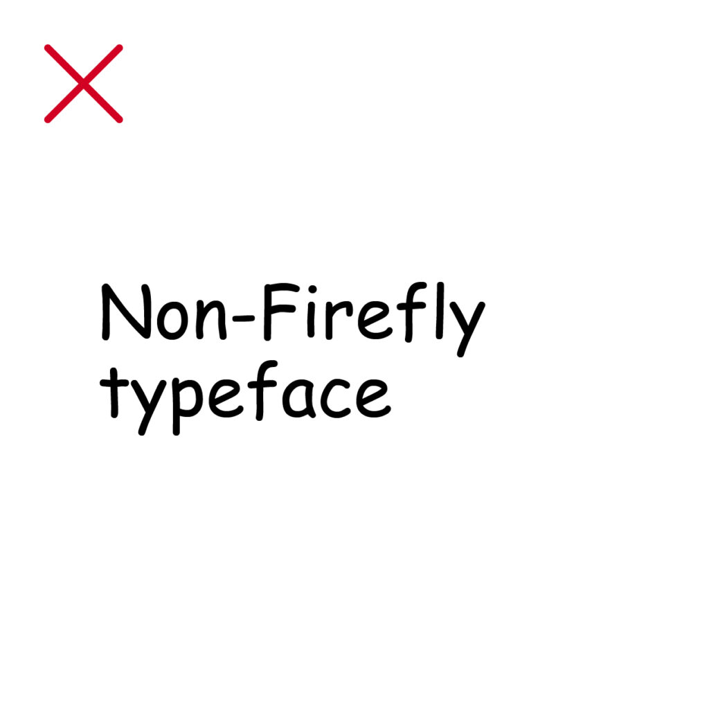
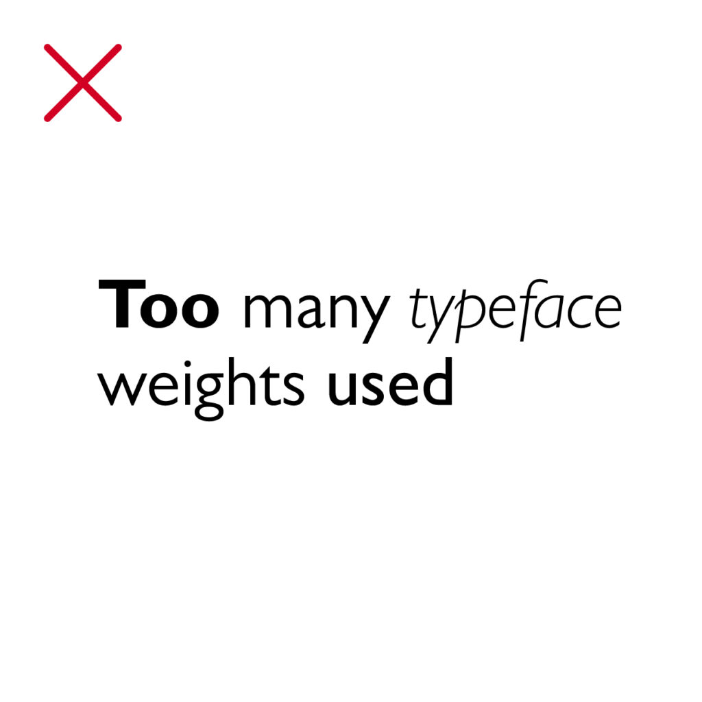
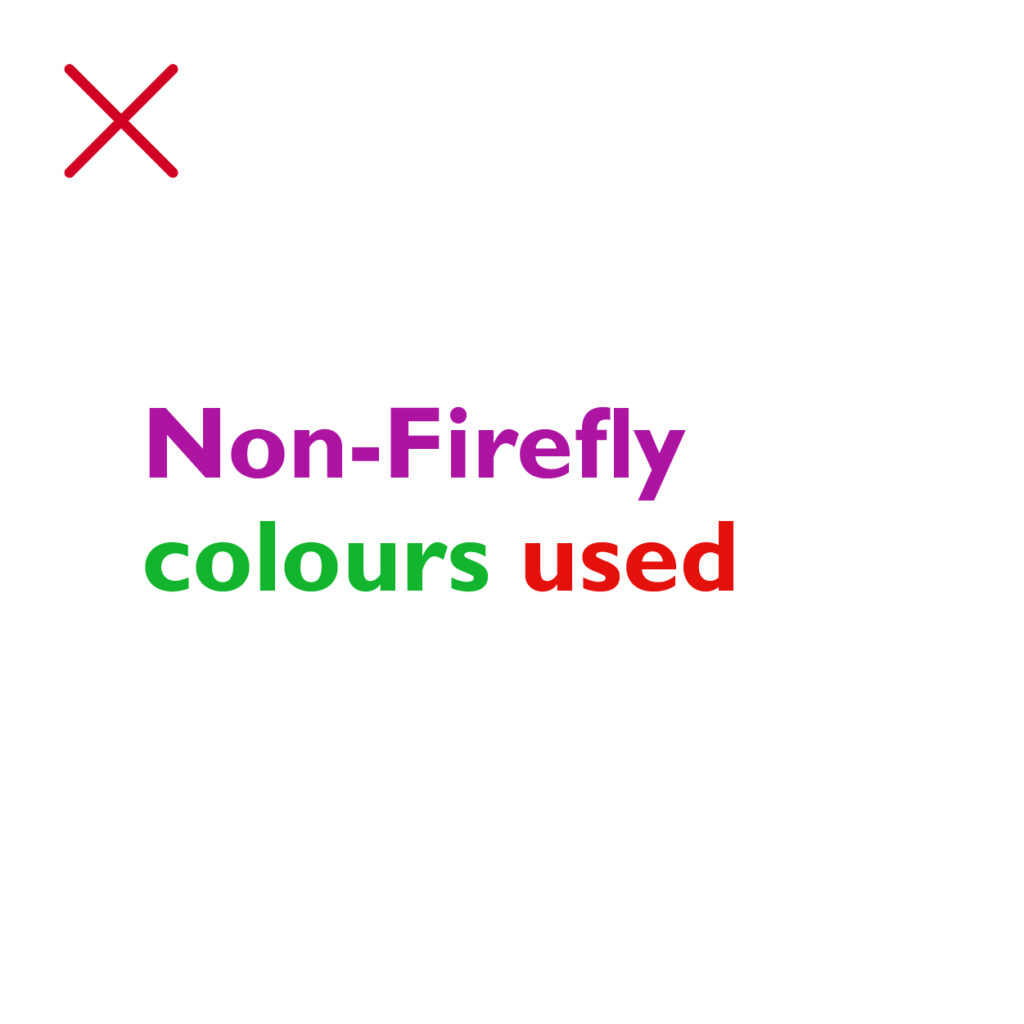
Incorrect usage
Here are some examples of common typographic mistakes.